NO NAMES
NO NAMES is a fast-paced startup redefining dating apps by enabling users to find a date in minutes. Also eliminating the need for endless swiping and chatting phases.
Year:
2024
Duration:
6 months
Deliverables and Tools:
Mobile Application - FigJam
Admin Panel - Figma
Pricing Plan - Ms. Excel
Graphics - Illustrator & Photoshop
Animation - Blender & Aftereffects
Target Audience
Age group : 18 - 35
Especially designed for those who struggle to get dates on traditional apps due to factors like not being photogenic, lacking conversational skills, or having limited time.
Challenges faced
Working on a non-traditional concept without existing references, aiming to make the UI intuitive and relatable so the target audience easily grasps it, even when this is something they've never seen or used before.
How it works


Homepage
The homepage uniquely features two modes, each tailored for a different user type:
-
Plan Mode: For users interested in going out based purely on the plan.
-
Profile Mode: For users who prefer to see who they're meeting.
Switching between modes is intuitive, triggered by a double-tap similar to Instagram’s like feature.
In Profile Mode, full-sized images focus attention on the user rather than the app, enhancing a direct, personalized experience.

Easy Navigation
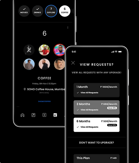
To help users easily track their interactions, circles display information in sent and received requests screen.
Users can quickly glance through these circles to find someone of interest, and can swipe to explore all their interactions at a glance.

Preset Messaging
A user interface designed for chatting in preset.
With options displayed within the text, and questions presented in a scrolling format at the bottom.
It also emphasizes states such as waiting for a reply, the time the message was sent, and the time the reply was received.

Icons
Since this dating app differs from traditional platforms, it features a unique navigation bar. The icons are designed to be intuitive, ensuring users from all backgrounds can easily interact with them.
1. Homepage: A home icon for easy access to the main page.
2. Sent Requests: An outgoing call icon, symbolizing the requests you’ve sent out.
3. Post a Plan: A plus icon, reminiscent of Instagram, indicating that you can post something here.
4. Received Requests: An incoming call icon, representing the requests you’ve received, stored in this section.
5. Profile: A universally recognized human icon, representing the user's profile.

Price Plan
The key to a business’s success is generating revenue from its users. Users can join the platform by purchasing a 1-week, 1-month, 3-month, or 6-month plan, or by simply joining for free.
While users on the 1-week, 1-month, 3-month, and 6-month plans are already paying customers, each plan offers different features to encourage upgrades.
The strategy was to convert free users into paying customers. Free users can post plans and send requests, but to view the requests they’ve received, they must pay. This pricing structure is designed with the user’s primary goal in mind—finding dates. This way the users will give-in easily to see who is willing to go out with them.
Graphics for performance marketing : Carousels


